
Teaching Data Analysis with Real Estate Data



The good students push themselves through a dreadful collection of Greek letters, memorize an array of formulas, and pass an exam. They may have even earned an A. How much they actually remember a few years later, not to mention how much they can actually apply their statistical knowledge personally or professionally, is another story.
(封面出處:Unsplash)
In this era of big data, everyone wants to have some basic knowledge in data analysis. Big data, data analysis, artificial intelligence, neural networks, and deep learning are all increasingly important skills in this data intensive world. Serving as professor of the MBA core course on data analysis at College of William & Mary, the oldest public university in the United States, I often need to wrestle with ways of introducing core data analysis concepts to my students from diverse professional backgrounds in the most time efficient manner.
Statistics is a branch of mathematics that derives its beauty from elegant and concise mathematical equations. It is, however, also an academic topic about which many people feel ambivalent. They are told it is important, and many are required to take a statistics course. The good students push themselves through a dreadful collection of Greek letters, memorize an array of formulas, and pass an exam. They may have even earned an A. How much they actually remember a few years later, not to mention how much they can actually apply their statistical knowledge personally or professionally, is another story.
These abstract representations can also be so terse that most people have trouble decoding them, if the concepts are presented as equations and symbols only. Is deviation the same as standard deviation ?? How is standard deviation different from standard score Z? What about standard error? Is that a special type of error ?? Isn’t error also called residual? Why does everything also have a Greek letter name? Most importantly, what is the point of standard deviation? Do businesses actually make use standard deviation to make money? As a result, much of the effort in learning statistics may be spent on decoding and applying mathematical equations and very little on its practical use. This is unfortunate because statistics is such a practical tool used in so many ways. For example, quality control in manufacturing, Netflix recommendations, and Google ads are all made possible by statistical analyses.
Having taught data analysis for years, I have noticed that classroom exercises using real estate data from the Zillow website are easy and effective tools for introducing core data analysis concepts to students. I have designed classroom activities using real estate data from the real estate website Zillow to illustrate core concepts of data analysis. Most of my graduate students have taken some form of statistics course at the undergraduate or high school level. However, they usually have retained very little and struggled to articulate the definition or use cases of basic concepts such as standard deviation. Therefore, I have assumed no prior prerequisite knowledge when designing these activities. These students have been introduced to probability concepts prior to taking my courses.
The first assignment in my MBA Data Analysis and MSBA Machine Learning courses is always for each student to go house shopping by choosing a real estate property in the local area. Students enter data points about their chosen properties into a survey. All of the student entries are compiled into a property dataset that we can then use for class discussions and exercises. Table 2 shows sample records from the most recent dataset1. The survey questions include both categorical variables (e.g., ZIP code) and numeric variables (e.g. Price). Price, like most financial data, is always skewed, which gives us the opportunity to discuss transformation. Therefore, we can use the same dataset to run a wide range of analyses by combining different categorical and numeric variables. We would spend the next month or so calculating numbers and analyzing the dataset in different ways. In fact, we can get through an entire semester of the introductory Data Analysis course using the same dataset and never run out of ideas.
| FName | ZIP code | Property Type | Year | Parking | Miles | Price | Zestimate | Zillow Days | Taxes | BED | BATH |
| Alexis | 23185 | House | 1999 | 4 | 4 | 355000 | 394200 | 7 | 2608 | 3 | 3 |
| Allan | 23188 | House | 1995 | 2 | 5.6 | 1300000 | 1283200 | 11 | 5007 | 4 | 4 |
| Andi Muhammad Farid | 23188 | House | 2017 | 1 | 3.8 | 349500 | 355300 | 105 | 2126 | 4 | 4 |
| Andres | 23188 | House | 2002 | 3 | 6.2 | 874000 | 882500 | 75 | 7011 | 3 | 4 |
| Andrew | 23185 | House | 1964 | 2 | 5.1 | 398000 | 428200 | 2 | 3087 | 3 | 3 |
| Andy | 23188 | House | 2002 | 2 | 5.8 | 899000 | 887400 | 4 | 6715 | 5 | 5 |
| Antoine | 23185 | House | 2006 | 4 | 3.5 | 895300 | 883700 | 19 | 4763 | 4 | 4 |
| Connor | 23188 | House | 2005 | 2 | 6.1 | 999999 | 994900 | 47 | 7143 | 4 | 5 |
| Brandon | 23185 | House | 2015 | 3 | 6.8 | 2100000 | 2040200 | 115 | 12251 | 4 | 5 |
| Table 2. Sample Data Records | |||||||||||
Student names are always included in the dataset. Seeing their own names associated with data records in the class dataset allows students to make personal connections to data, and to have tangible references to otherwise very abstract concepts, such as deviations and Z scores.
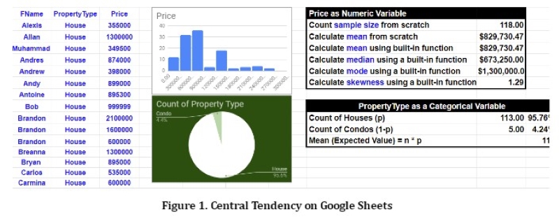
During the first week, students are introduced to basic descriptive statistics of numeric variables. Figure 1 illustrates how calculations of central tendency are set up on a shared Google Sheets file. These calculations using formulas are complemented with an “arts and crafts” exercise. Students are given round-shaped sticky notes, and are instructed to write down their names, raw scores (e.g., property age), deviations, and Z scores (i.e., standard score.) I demonstrate how to compute these scores on the Google Sheets file, and then students can find their own scores and copy them onto their own “data dots.” Questions to ask the class include: Who has a Z score of 1.96? Who is above 3? Below -3? Who has zero scores? Who is inside the 95% confidence interval? Who is outside? The Google Sheets file is accessible to all students (in view only mode) so they can follow along, inspect the formulas and consider how their own records contribute to the class statistics and models.
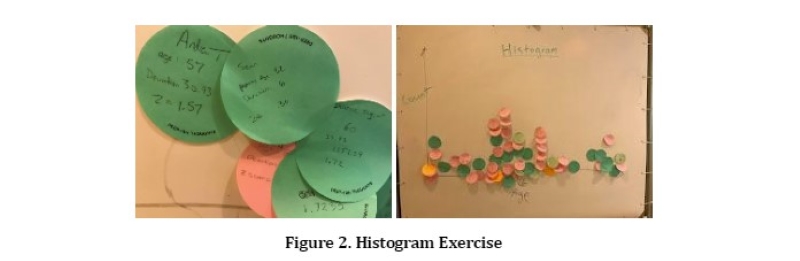
I always invite the entire class to come up to a whiteboard and to construct a histogram together using their data dots (see Figure 2.) This exercise is dynamic, fun, and participatory. The physical experience of constructing a data dot individually, and then a histogram together as a class, reinforces basic but important statistical concepts discussed above. Students can clearly see where they are located on the distribution, how their positions on the histogram are reflected by their Z scores, and how deviations tell us about their relationships to the class mean. Together, the class can also compute variance, standard deviation, skewness, and other properties that belong to the entire class sample rather than individual records. This is particularly effective in helping students distinguish linguistically confusing terms, such as deviation (of a case) vs. standard deviation (of a sample), and standard score (of a case) vs. standard deviation (of a sample.) It also creates a deep appreciation of the relationship between a case, and a dataset. After the hands-on activity, I demonstrate how to create the histogram on the computer using a variety of software programs, such as Google Sheets, JASP, and Tableau. Students can then clearly see that the computer programs simply automated the manual process of putting together a histogram.
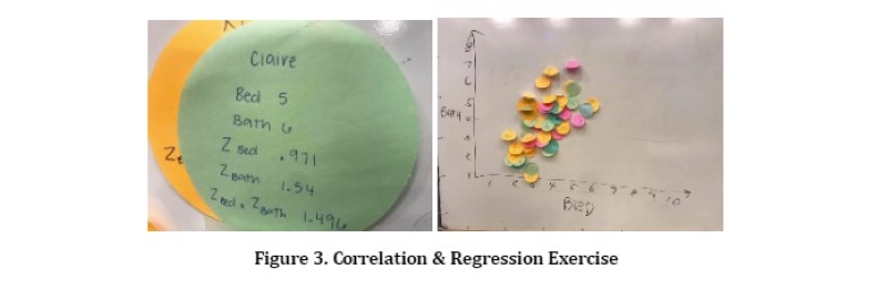
When discussing correlation, again I ask students to make “data dots,” but this time with their own data records for two, instead of one, variables (e.g., number of bedrooms, or “BED”, and number of bathrooms, or “BATH.”) The students would also write down their own Z scores for these two variables, and multiply them together. The class can then look at the Google Sheets to see how to add all of these scores up together, and divide the total by (sample size -1) to obtain Pearson’s Correlation r. Students are invited to put up their data dots on the whiteboard to construct a class scatterplot together. We can then use the scatterplot to discuss regression, residuals, model fit, and other important concepts of predictive modeling (see Figure 3). Again, I follow up with a demonstration of calculating correlation and creating scatterplots using Google Sheets. See Figure 4 for an example.
The real estate dataset is a good teaching tool for two key reasons. (1) The business domain knowledge is easily accessible to the general population. For example, most people intuitively understand that bigger houses (i.e., a larger square footage) will probably be more expensive, and adding a bathroom is probably going to increase the value of the property. Also, (2) relationships between the variables are usually very strong and predictable. For example, the number of bedrooms is always highly correlated with the number of bathrooms, and so we can always use them to discuss multicollinearity. Each additional bedroom is always going to add a significant chunk of value, and so we can always count on the beta coefficient of the regression model to be significant and positive. Therefore, instructors do not need to worry whether the statistical magic will work again in a new semester or not. The real estate dataset is also excellent for teaching prescriptive analytics. For example, students can determine which ZIP code has higher property values, by running T tests. Students can also determine which property type (house vs. condo) is older.
Most importantly, Zillow uses their dataset to produce Zestimate, a real-world application of predictive modeling, or machine learning predictions, for estimating property valuation (Schneider 2019). Conceptually, Zestimate is similar to the notion of home appraisals, which are intuitive for most people, including our students, to understand. However, few would immediately feel that they know how to create the estimates on their own. When the students realize that they can build their own Zestimate models after having learned predictive modeling, they often get a great sense of accomplishment. The class can build their own Zestimate equations, make their own predictions, and calculate individual students’ residuals (i.e., the amount of mispredictions. These models are very easy to interpret. For example, the beta coefficient shows how much the price would increase if the house had an additional bedroom, or how much the price would drop, if the house moves from one ZIP code to another. These simple, vivid, and intuitive exercises make the rather abstract concepts and Greek letters (e.g., ?) easier to digest, remember, and apply.
This manual process is not only critical for illustrating the inner works of predictive models, and the method of evaluating predictive model performance, it is also crucial for students to see how predictive models work in the real world, when we visit the Zillow Research site2 together to study additional explanations of Zestimate. Again students feel a great sense of satisfaction when they realize that they can actually understand all the technical jargon that explains how Zestimate works!
To sum up, data analysis, commonly known as statistics, can be intimidating due to its numerous jargon, symbols, and obscure terminologies. It is easy and fun to make these abstract and technical concepts much more concrete and approachable by having students participate in the process of putting together a real estate dataset manually.
1The dataset and the associated analyses are available upon request.


